Kitchen Colour Psychology Explained
When buying your next ex display kitchen, what colours should be used and what will they add to your space? Here is kitchen colour psychology explained.
When you’re looking to buy an ex-display kitchen, you may think about options you’d never considered for yourself before. That’s one of the joys of finding a bargain in this way – it pushes you outside your comfort zone and you might just find something you never knew you loved.
Colour is one such discovery to be made for a kitchen – it can add such a different dimension to a space which can be cold and characterless when done badly. But, what colours should be used for the kitchen, and what will they do to your space? Coastal Living has a breakdown of colour psychology and application in the kitchen to go alongside.
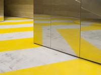
Yellow is the colour of sunshine and happiness, but in reality, it’s all about energy. In other spaces, yellow can be seen to cause more arguments, as an influx of energy when you’re trying to relax isn’t the most helpful. It’s perfect for the kitchen however, which is traditionally a ‘doing room’ and it’s sure to give you an energy booster in the morning. Some studies even found that yellow can help digestion, so it really could be a match made in heaven.
Green’s power comes from nature, bringing with it relaxing and healing vibes. Some believe it may promote healthier choices in the kitchen, and it also has links to cleanliness which you’d definitely want your kitchen to project.
It’s believed in advertising that red can increase your appetite – great
for dinner party guests, maybe not so much for your everyday eating. Like yellow, red packs a punch with energy, and too much can create the wrong mood. Best save it for colour pops against a more neutral, calming backdrop to get the right balance.
Blue is a colour which works well in every room in the house, and in fact, has been voted the world’s most popular colour. Serene and calming, while clean and fresh, it can create a subtle mood, however, in the wrong room it can be too cold. In south-facing rooms it is given a warm up by the sun, but in north-facing ones, it may feel too oppressive.
Purple is the colour of mystery, royalty and magic, so is perfect for an entertaining kitchen to add a touch of sparkle. Deep, saturated purples may come off too strong in a small space like a kitchen, but trying lighter violets on walls and in accessories is sure to give it a soft touch.
Pink is undoubtedly the colour of the moment, but it’s hyper feminine ties can make it a hard sell to male-dominated households. Time to remind them it’s just a colour, and that once upon a time baby boys wore pink and girls blue, so a pink kitchen doesn’t have to be one just for girls.
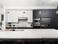
Neutrals also count as colours, with white promoting sterile cleanliness, serenity and clarity, which can be warmed up with natural shades of brown in the form of wooden worktops and accessories.